The Indie Horror Problem
I’ve played quite a few indie horror games in the past few years, and I’ve hated most of them. My biggest complaint with these titles is that they tend to use the same toolkit to try and elicit fear in the player. They sport retro-styled visuals, break the fourth wall, and are filled with lame jump scares. The visual style is often accomplished by coupling basic 3D geometry with a pixelated screen effect. The fourth wall is broken by crashing the game, making the game look like it’s glitching or creating files on the player’s desktop. Jump scares aren’t hard to conjure up.
These characteristics often feel disjointed and misused. There’s nothing wrong with any of them in particular, but they need to have some relationship to feel significant. These titles aren’t deprived of unique elements, but those elements have no cohesion with the game’s less original aspects. This is why SEPTEMBER 1999 is a breath of fresh air. Despite having minimal interaction and a measly length of 5 minutes, its visual style and story complement each other in a way that feels wholly unique.

Coming Soon to Videocassette
SEPTEMBER 1999 kicks off with the familiar sound of someone loading a tape into a videocassette player. The game wants you to feel like an unsuspecting audience to a set of unlabeled videos, watching through them to discover what they hold. During gameplay, you control the cameraman, “exploring” the available rooms. The tapes gradually get more concerning, culminating in a disturbing final tape that sheds light on what the tapes’ author was up to.
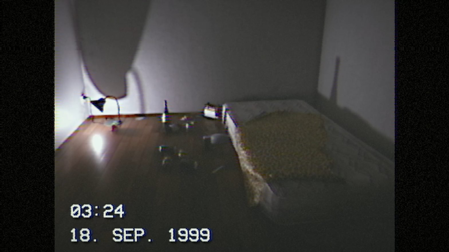
Horror games centered around VHS tapes and the grungy aesthetic they carry are becoming more frequent these days. Despite this, SEPTEMBER 1999 manages to set itself apart. The game aims for a specific visual style that replicates the feel of home movies from the 1990s, which directly plays into the game’s overarching narrative. The game forces a 4:3 aspect ratio, a tracking effect occasionally distorts the image, and a time code overlay signals where the tape falls in the story’s chronology. Pausing the game replicates pausing a tape, keeping the player immersed in the setting while conveying the game state. The audio has a constant hiss, and the sound effects triggered by kicking around empty cans have a lo-fi quality to them.
Similar to other indie horror titles, the game’s simple geometry and textures are masked by various filters and effects. However, unlike those games, the visuals of SEPTEMBER 1999 tie directly into its presentation. You’re supposed to be watching videotapes, so obscuring the environment with fuzziness and bad tracking doesn’t feel out of place. In other horror titles, the hazy visuals (often through pixelization) are usually unjustified, not playing into the game’s setting or narrative. The dual purpose of SEPTEMBER 1999’s aesthetic shows how narrative choices can be used to complement a game’s visuals, rather than draw attention to them.

Be Kind, Please Rewind
Although SEPTEMBER 1999 is incredibly short, the way the game uses its presentation to its advantage left an impression on me. Indie horror titles often fail to tie their various elements together, simply latching onto what’s currently popular without much thought. This can leave them feeling like a mess of unoriginal ideas. However, this game doesn’t fall into that trap, as its visual style and narrative are simpatico.
It could be scarier, and the inability to interact with the environment leaves something to be desired, but it’s hard to argue with a $0 price tag. Given its 5-minute length and low bar to entry, I’d recommend SEPTEMBER 1999 to anyone who’s a fan of horror media. 98DEMAKE certainly has my eye, and I hope they’ll continue creating these bite-sized experiences with unique presentations.
